The modern way to draw squircles using corner-shape in CSS
For years, we’ve faked “characterful” corners with SVG masks, pseudo-elements, and more than a few headaches. The problem? Border-radius only controls size, not shape.
The experimental (and fairly new) corner-shape property changes all that by letting us define the actual shape of an element’s corners directly in CSS. Squircles! I’m looking at you.
With a single declaration, we can turn convex curves into concave scoops, carve precise notches, or dial in superellipse geometry, while borders, shadows, and backgrounds follow the cut. It’s progressive enhancement in the truest sense: a new layer of polish, no hacks required.
- What is the
corner-shapeproperty? - How it differs from border-radius
- Some examples
- What about fallbacks?
- Best practices
What is the corner-shape property?
The corner-shape is an experimental CSS shorthand that defines the actual shape of a box’s corners within the area established by border-radius.
It can use keywords like round, scoop, bevel, notch, square, squircle, or a numeric superellipse() function. Backgrounds, borders, outlines, shadows, overflow, and backdrop-filter will follow the defined corner shape.
.box {
  width: 200px;
  height: 200px;
  border-radius: 32px;
  corner-shape: squircle;
}
One thing to keep in mind is that the property only has an effect when a non‑zero border-radius is present. Without it, the corners will remain square regardless of the corner-shape value.
And like many CSS properties, corner-shape is a shorthand that can accept up to four values to define different shapes for each corner individually.
.box {
    corner-top-left-shape: scoop;
    corner-top-right-shape: notch;
    corner-bottom-right-shape: squircle;
    corner-bottom-left-shape: round;

    /* or using the shorthand */
    corner-shape: scoop notch squircle round;
}
It supports smooth animation between shapes because keywords map to superellipse() equivalents, and browsers constrain opposite corners to avoid overlap.
How it differs from border-radius
The border-radius sets the corner’s size (how far it rounds). While the corner-shape sets the corner’s geometry (what kind of curve or cut it is).
For instance, border-radius: 30px with corner-shape: round behaves like classic rounded corners. Changing to scoop inverts the curve into a concave cut; bevel draws a straight chamfer; notch creates an inset; squircle makes superellipse-style corners—all while the radius still controls extent.
Apart from this, corner-shape: round matches the normal border-radius look; corner-shape: square effectively cancels the rounding even if a radius is set.
Some examples
Here’s a graphic showing different corner-shape values applied to boxes with the same border-radius.
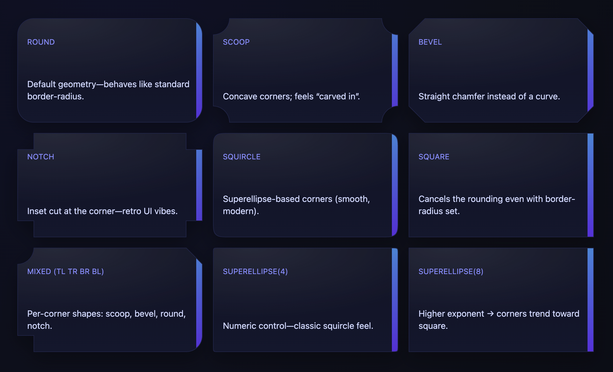
As you can tell, each shape gives a distinct visual style while respecting the same radius size. This opens up new design possibilities without complex SVGs or masks.
Try this CodePen in a latest Chromium-based browser to see it in action.
Also, try this website to play around with different corner-shape values interactively: squircle.style
What about fallbacks?
Since corner-shape is still experimental (currently only available in Chrome 139 and above or similar Chromium forks) and not widely supported yet, it’s important to provide fallbacks for browsers that don’t recognize it and make it a progressive enhancement.
Here are safe, production-ready patterns to use corner-shape with a border-radius fallback. The idea: write classic border-radius first, then layer corner-shape inside @supports so unsupported browsers keep the rounded corners.
Basic keyword shape fallback
.card {
  /* Fallback everyone supports */
  border-radius: 24px;

  /* Only apply corner-shape where supported */
  @supports (corner-shape: round) {
    /* round is the default; use a different shape */
    corner-shape: scoop; /* concave corners */
  }
}
Per-corner values with fallback
.badge {
  border-radius: 16px; /* fallback */
}

@supports (corner-shape: bevel) {
  .badge {
    /* TL, TR, BR, BL shapes (clockwise) */
    corner-shape: bevel notch round squircle;
  }
}
Using superellipse() with fallback
.panel {
  border-radius: 32px; /* fallback */
}

@supports (corner-shape: superellipse(4)) {
  .panel {
    corner-shape: superellipse(4); /* squircle-like */
  }
}
Progressive enhancement inside @supports selector block
/* default styles */
.box {
  border-radius: 20px;           /* fallback */
  background: white;
  box-shadow: 0 6px 20px rgba(0,0,0,.12);
  border: 1px solid #e6e6e6;
}

/* enhance where supported */
@supports (corner-shape: notch) {
  .box {
    corner-shape: notch;
  }
}
Some engines may support keywords but not the function. Query the specific thing you rely on:
.card { border-radius: 28px; }

@supports (corner-shape: scoop) {
  .card { corner-shape: scoop; }
}

/* If you need the numeric control, guard the function separately */
@supports (corner-shape: superellipse(6)) {
  .card { corner-shape: superellipse(6); }
}
Best practices
Here are some tips for using corner-shape effectively:
-
Order matters: Always declare border-radius first, then corner-shape inside @supports. Unsupported browsers ignore the @supports block and keep the radius.
-
Dependency: corner-shape only has an effect when border-radius is non-zero. Keep a radius in your fallback.
-
Resetting: corner-shape: square effectively removes rounding; do not use it if you want a rounded fallback.
-
Animation fallbacks: If you animate corner-shape, also include a non-animated border-radius experience, or animate border-radius as a simpler fallback.
-
Granular queries: If you target logical shorthands (e.g., corner-start-start-shape), guard those in @supports too, since support may differ from the main shorthand.
-
Server-side rendering/theming: Prefer simple keyword shapes for broader compatibility; reserve
superellipse()for environments where you’ve verified support.

👋 Hi there! This is Amit, again. I write articles about all things web development. If you enjoy my work (the articles, the open-source projects, my general demeanour... anything really), consider leaving a tip & supporting the site. Your support is incredibly appreciated!
