Handling images with inconsistent height in CSS
When you’re working with CSS, you often stumble upon a situation where you need to display a list of images with different heights.
And often, you would need to align the images in a grid-like fashion. For instance, you may want to display a list of products in a grid-like fashion.
The problem
The problem here is, the images may have different heights. And if you try to align them in a grid-like fashion, you may end up with a weird-looking layout.
So, for instance, check the following HTML markup of one such scenario.
<div>
    <img src="/images/inconsistent-height-images/150x150.png" >
    <img src="/images/inconsistent-height-images/150x250.png" >
    <img src="/images/inconsistent-height-images/150x100.png" >
    <img src="/images/inconsistent-height-images/150x350.png" >
</div>
Here’s how this would look when it’s rendered in the browser.

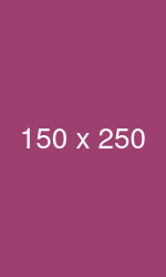
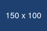

As you can see, the images are not aligned properly. And this is because the images have different heights.
The solution
To fix this, we can use the object-fit property of CSS. This property allows us to specify how the content of an element should be resized to fit its container. We can set the value of this property to contain to make the image fit the container.
Apart from this, we can also use the newly added aspect-ratio property of CSS to make the aspect ratio of the image consistent.
img {
    width: 25%;
    aspect-ratio: 3/2;
    object-fit: contain;
}
Here’s how this would look when it’s rendered in the browser.
As you can see, the images are now nicely contained and aligned properly with a consistent height!
This solution is courtesy of this tip by Wes Bos.
One more solution
If you’re not concerned about the content of the image being cropped off, you can also use the object-fit property with the value of cover to make the image fit the container entirely.
img {
    width: 25%;
    aspect-ratio: 3/2;
    object-fit: cover;
}
Here’s how this would look when it’s rendered in the browser.
Playground
Here’s a CodePen I created if you want to play around with the code.
See the Pen Imgaes with incositent heights by Amit Merchant (@amit_merchant) on CodePen.

👋 Hi there! This is Amit, again. I write articles about all things web development. If you enjoy my work (the articles, the open-source projects, my general demeanour... anything really), consider leaving a tip & supporting the site. Your support is incredibly appreciated!
